
Looking · 3 min read
Negative space in watercolour: let the paper hold the light
Why an unpainted shape can carry more light, structure and feeling than another brushstroke.
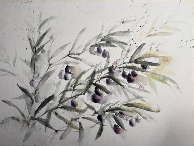
In transparent watercolour, the brightest light is often not white paint. It is the paper left untouched. Negative space is the shape around and between the subject, but it is not empty; it controls rhythm, separation and breath.
Learning to see that space turns painting from filling an outline into arranging connected shapes.
Look for shapes, not names
Place a leafy stem against a plain surface. Instead of thinking “leaf, stem, leaf”, notice the pale wedges between leaves and the irregular spaces between the branch and the edge of the page.
Turn the reference upside down for a moment. Familiar objects become less insistent, making the surrounding shapes easier to compare.
A leaf exercise without masking fluid
- Draw a loose rectangle and place a simple branch across it.
- Mark three paper-white spaces that must survive to the end.
- Mix one generous mid-value wash and paint the background around two or three leaf shapes.
- Allow some leaf edges to be described by the background; paint other leaves directly.
- When dry, add one darker connection where the branch needs weight. Leave the saved whites alone.
Studio noteMake the saved spaces different sizes. Repeated, equal gaps feel decorative; varied intervals create movement.
Preserve light by planning connections
A white shape is strongest when it belongs to the composition rather than appearing as a collection of tiny accidental holes. Before painting, trace a possible route of light with your eye. Can one pale area lead into another? Can the background wash connect around them?
Connected washes dry more naturally and reduce the urge to outline every object separately.
Correct less, compare more
If a negative shape feels wrong, compare its width, angle and distance from the page edge before correcting it. The problem may be the neighbouring painted shape rather than the white itself.
Small inaccuracies can remain. What matters is whether the pattern of painted and unpainted shapes feels balanced at a glance.
What to notice in finished paintings
- Where does untouched paper create the brightest interval?
- Which edge is fully stated, and which is completed by the viewer?
- Do pale spaces connect or sit as isolated spots?
- How does the artist stop before every area is explained?
Look through Jurga’s available watercolours and sold archive to see how open paper, soft edges and concentrated marks work together.
View watercolour paintings